Redesigning GSK US Medical Affairs Resources Landing Page
The US Medical Affairs platform — spanning 10+ disease-education landing pages across US, CA, and EU markets — was meant to serve healthcare professionals, patients, and internal teams. Over time it became cluttered, hard to navigate, and inconsistent with the latest brand guidelines, directly impacting engagement and conversion across all regions.

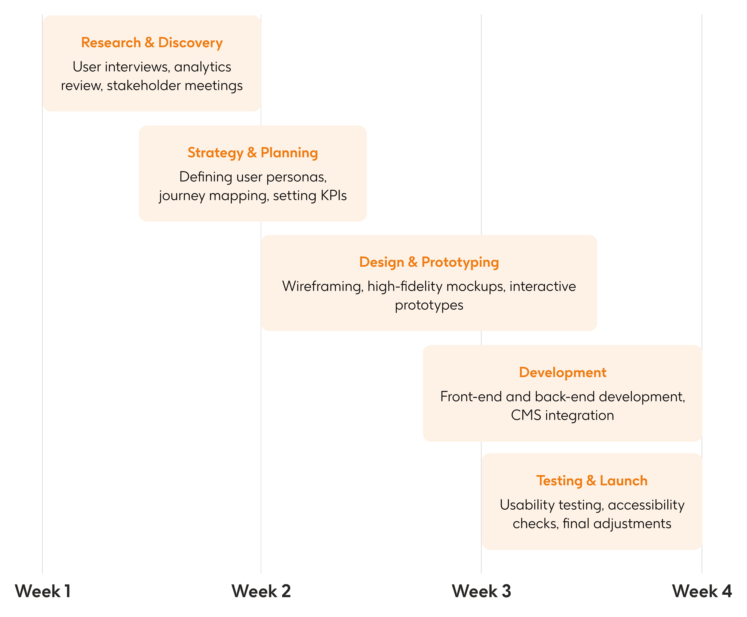
Project Timeline: 4 weeks
Problem Statement
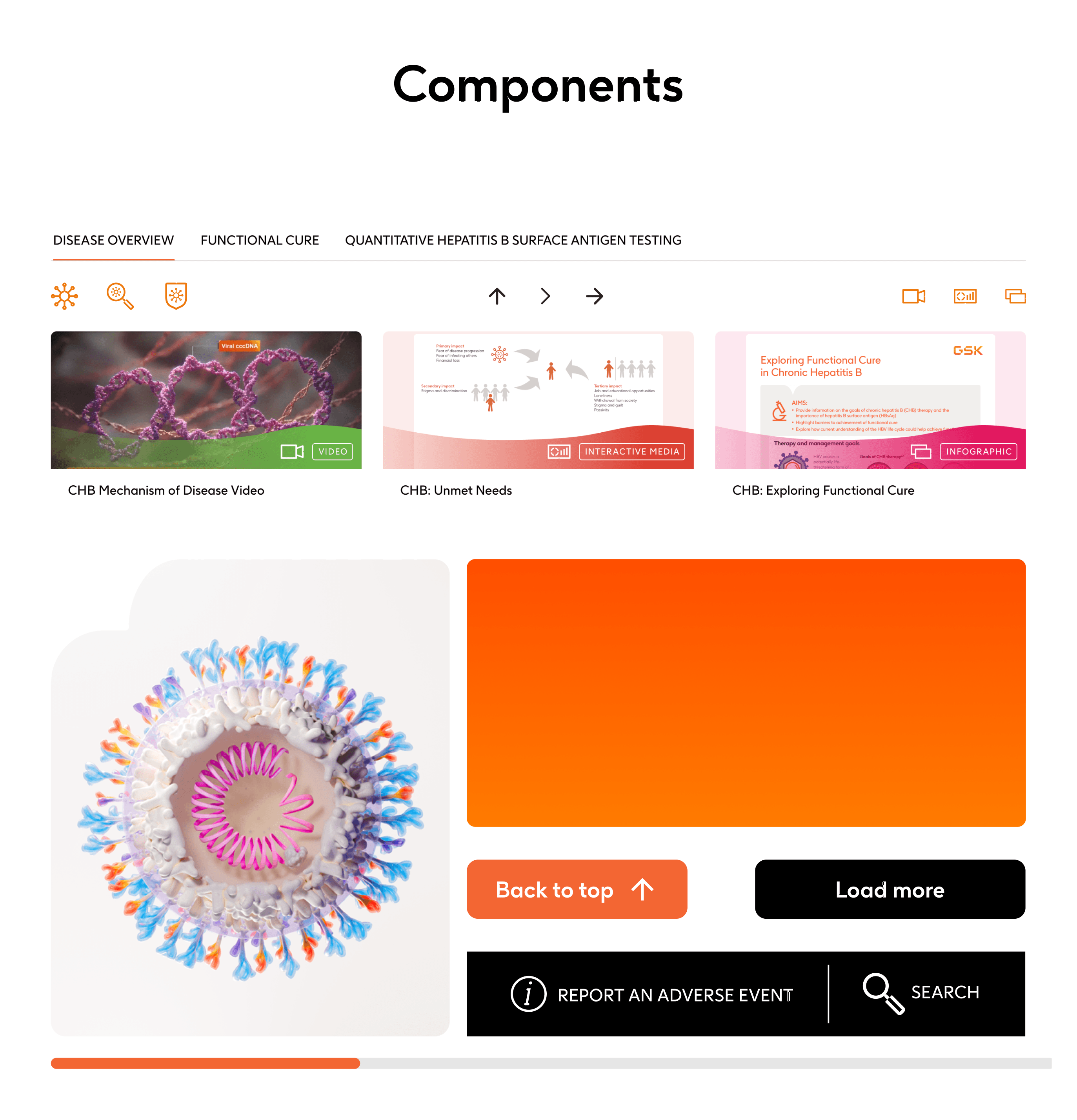
The original platform had an outdated interface that was difficult to navigate, causing frustration across all user segments. Spread across 10+ disease-education landing pages serving US, CA, and EU markets, the experience lacked consistent visual hierarchy and clear content structure — making it hard for healthcare professionals, patients, and internal teams to find what they needed. Complex workflows and redundant content were driving users away, reducing time-on-page and click-through rates. The task was to simplify the user journey, reduce cognitive load, align with GSK's updated brand guidelines, and deliver a scalable, accessible experience across all markets within 4 weeks.
Goals & Success Criteria
Enhance User Experience: Simplify navigation and improve the overall user journey across all disease-education pages.
Brand Alignment: Update the visual design to mirror GSK's modern brand aesthetics consistently across US, CA, and EU markets.
Responsive Design: Ensure seamless access across all devices, including mobile and tablets.
Content Optimization: Reduce redundancy and present information in a concise, scannable manner.
Increase CTR: Achieve a 30% uplift in click-through rate across all markets within 4 weeks.
Increase Engagement: Boost the average time users spend on the site by 25% within two months.
Improve Accessibility: Ensure all pages meet WCAG 2.1 AA standards, making the experience accessible to a broader audience.
Research and Discovery
Heuristic Evaluation: Audit for identifying existing problems and finding weakness in existing design

Qualitative Research (The "Why"): Conducted interviews with 50 users from each segment to gather Qualitative insights.

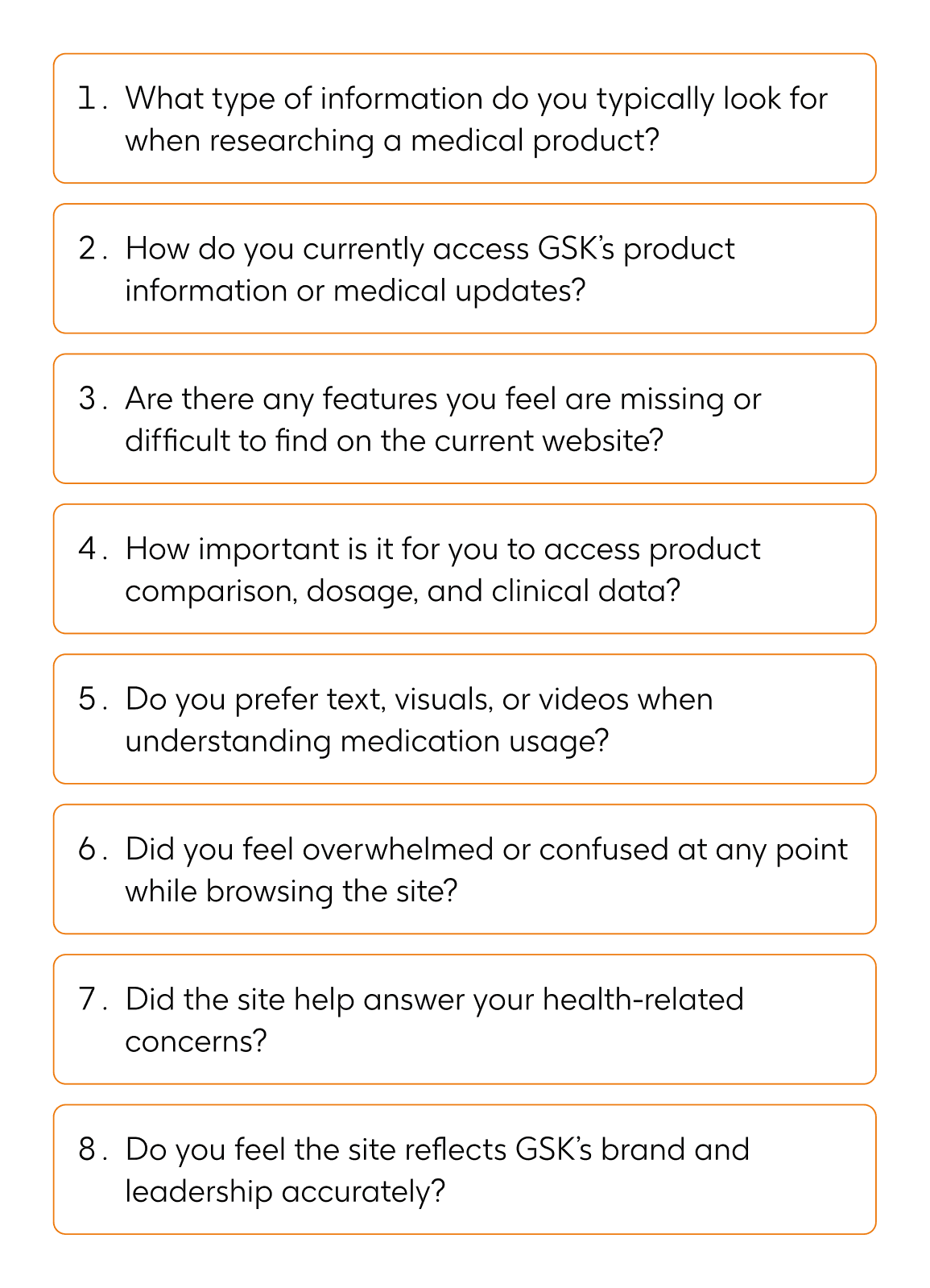
Quantitative Research (The "What"): Conducted interviews with 50 users from each segment to gather Quantitative insights.


Competitor Analysis: To better understand industry standards and user expectations, we examined three major pharmaceutical/healthcare websites that offer comprehensive medical resources similar to GSK. Our analysis centered on content organization, ease of navigation, branding consistency, and accessibility.

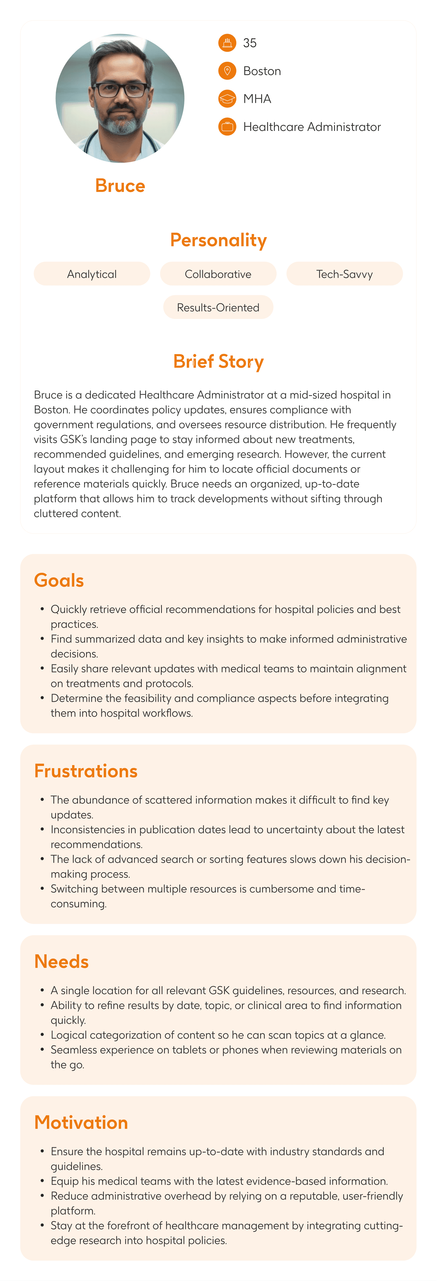
Strategy and Planning
User Personas: Documenting the pain points are user base feel along with frustration level


Journey Mapping: Users navigating through the website

Information Architecture: Preparing skeleton of the updated site

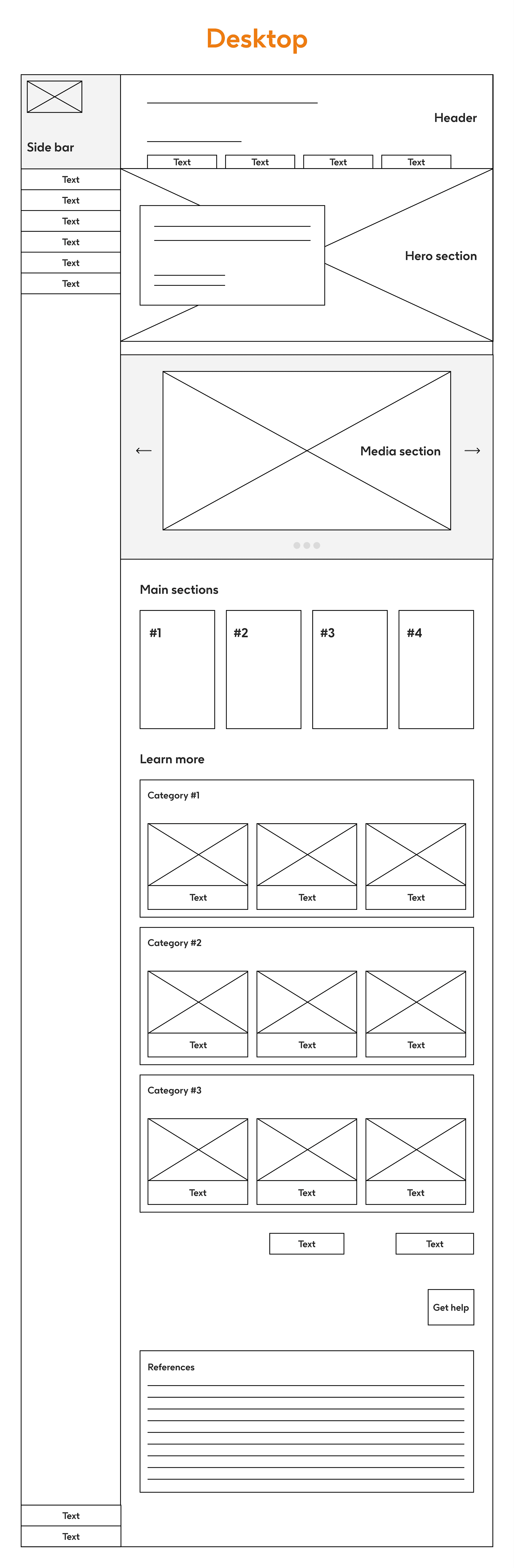
Design and Prototyping
Wireframing: Prepared a lo-fi wireframes for desktop and mobile responsive version

Design System: Over 50 scalable, responsive design-system components were built in alignment with GSK's brand guidelines and WCAG 2.1 AA standards — ensuring consistency across all pages and reducing design-to-development turnaround by 30%.

Prototype: Prepared a high-fidelity prototype based on feedback and approval of wireframe


Development
Handoff & Developer Walkthroughs: Detailed handoff documentation was prepared in Figma — including annotated specs, redlines, and design tokens — covering all 10+ pages across the three markets. Multiple walkthrough sessions were held with the frontend team to align on implementation scope and interactions. This structured handoff process reduced design-to-development turnaround by 30% and cut implementation revisions by 50%, keeping the project on track within the 4-week timeline.

Testing and Launch
Usability Testing: Remote moderated usability tests were conducted with users across all three segments — healthcare professionals, patients, and internal teams. Each issue uncovered was assigned a severity score to prioritise fixes effectively. This structured approach led to a 25% improvement in task success rate, validating the redesigned navigation architecture and content hierarchy before launch.
Interactions: All micro-interactions and page transitions were reviewed end-to-end to ensure a seamless, bug-free experience across desktop and mobile.
30%
Increase in CTR
25%
Increase in average time-on-page
25%
Improvement in task success rate